
Modernization comes in many forms. Sometimes, it’s updating to take advantages of newer technologies and architectures. Other times, it’s simply about implementing additional code to take advantage of core functionality. This week, I decided to take a moment to modernize my blog site by implementing support for a dark theme and the prefers-color-scheme CSS media feature. If you’re not familiar with the concept, most browsers and operating systems allow you to choose whether to display a “light” theme (such as black text on a white background), “dark theme” (white text on a black background), or “automatic” (choose a theme based on the time of day). I wanted this site to react to that preference.
Like any good software application, my site has a separation of concerns. The content is stored in Markdown, the layouts in HTML templates, and the overall style is managed as Sass SCSS syntax stylesheets. These styles are converted to CSS at build time, making it easy to manage the overall look and feel. While some parts of Hugo’s styling is managed outside of this, I’m able to manage most of the site design this way. I use variables to capture the colors and some key styles. For example:
This means that I can manage the color pallette from one location. This is compiled directly into the stylesheet, with the variables replaced by the values. To adopt support for color scheme preferences, I took advantage of these variables. In addition, I took advantage of CSS custom properties (variables) to enable me to dynamically style the content.
First, I modified the SCSS to create variables at the document’s :root:
Next, I added a nested media selector for the dark theme and adjusted the values appropriately:
When the a browser prefers a dark color scheme, these colors will be used instead of the original definition. To implement this across the site, I now just needed to update the SCSS variables to utilize the CSS var instead of a hard-coded value.
1$background: var(--background);Instead of the compiled CSS having specific color values, it will have custom properties that define the colors. This will enable the styles to dynamically respond to the selected theme. The final combined definition looks something like this:
1:root {
2 --background: white;
3 --text_regular: black;
4 --text_strong: #212529;
5
6 @media (prefers-color-scheme: dark) {
7 --background: black;
8 --text_regular: white;
9 --text_strong: #e0e0e0;
10 }
11}
12
13$background: var(--background);
14$text_regular: var(--text_regular);
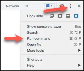
15$text_strong: var(--text_strong);To test this, I used the F12 developer tools in Chrome. Under the upper-right menu, I selected Run Command:
Next, I chose Emulate CSS prefers-color-scheme: dark:
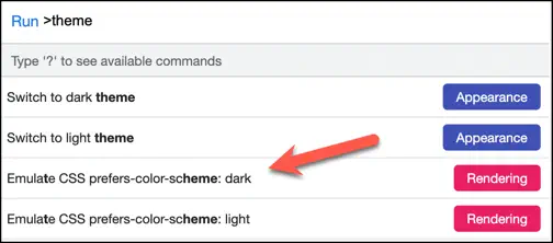
This allowed me to verify the look of the site without having to change the global theme (or wait until the evening hours). Once I was happy with results, I reopened the tools and chose Do not emulate CSS prefers-color-scheme. This reset the browser tab back to the default state.
Depending on your settings and the time of day, you can see the results. 😄