
There are a lot of aspects to Azure. The one that still continues to amaze me is how configurable Microsoft has made the Azure experience. One of my favorite experiences with Azure was discovering that it was possible to customize the UI that gets presented when you deploy resources.
If you’re like most Azure users, you’re used to the default deployment experience. When you deploy your own template, you see something like this:
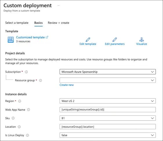
One fundamental concept of Azure that’s important to understand - nearly every service and feature in Azure that you see is built on top of the same core Azure services and frameworks that we can use for our own deployments. Believe it or not, this includes the deployment process! The same interface components that are used to deploy from the Azure marketplace are also available for your resource deployments.
Enter the Sandbox
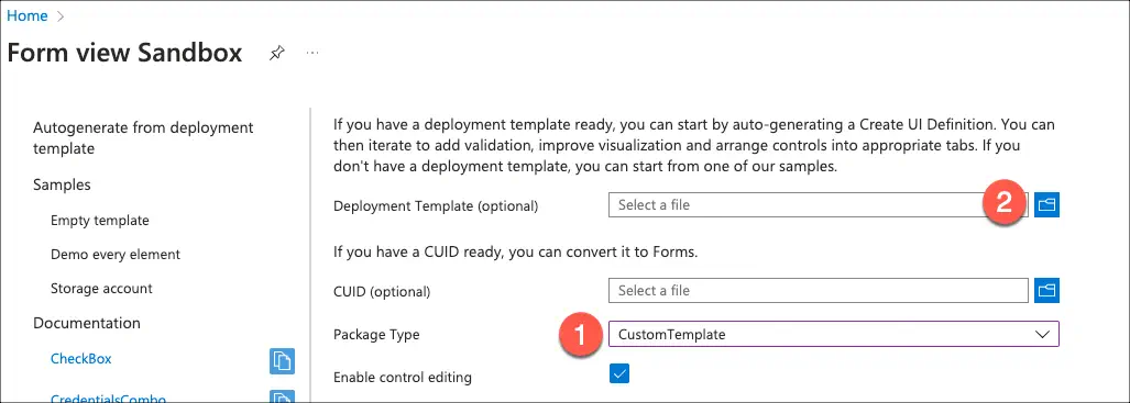
The first thing to know is that there’s a special blade available in your Azure portal. Its purpose is to let you customize a user interface and test it out. You can find it here: https://ms.portal.azure.com/#view/Microsoft_Azure_CreateUIDef/FormSandboxBlade.
The easiest way to get started is to follow these in order:
Change the Package Type to CustomTemplate. This ensures that you see the correct views.
Click the folder icon beside Deployment Template (optional) to select an existing ARM template to upload.
Acknowledge that generating the definition will overwrite the current changes.

You will now have a default environment setup for editing. The Preview button at the bottom allows you to see the working UI. Just click the X in the upper right corner to exit the preview and return to editing.
There’s one more control to know about. The Enable control editing is used to toggle between a rendered view (unchecked) and an editor preview. The editor preview enables you to click on a panel and edit it with a graphical display. It also has an integrated JSON editing experience. When this is enabled, you can click on any control to edit its configuration, debug its outputs, or customize the JSON.
The form schema
The basic form structure looks like this:
 1{
 2    "$schema": "https://schema.management.azure.com/schemas/2021-09-09/uiFormDefinition.schema.json",
 3    "view": {
 4        "kind": "Form",
 5        "properties": {
 6            "title": "Web Application",
 7            "steps": [ ]
 8        }
 9    },
10    "outputs": {
11        "parameters": {},
12        "kind": "ResourceGroup",
13        "location": "[steps('basics').resourceScope.location.name]",
14        "resourceGroupId": "[steps('basics').resourceScope.resourceGroup.id]"
15    }
16}
The schema and kind are fixed values. There are only two properties – a title that is displayed at the top and the steps that are displayed to users. The outputs block is different depending on the type of deployment. In this case, I’m using a ResourceGroup deployment. That has to provide the location for the resource group, the resource group ID, and any parameters that need to be passed to the template. The parameters will use functions to read values from the steps and provide those to the ARM template for deployment. The available functions are very similar to the ones in ARM templates and use [] to indicate an executable block. The main function you will use for outputs is steps. It has the form: steps('stepName').elementName. For example, to reference the value of textBox1 from the step called basics, you would use steps('basics').textBox. Just remember that everything is case sensitive!
Step by step
Steps represent the top tabs that exist in the final Form. They are represented as JSON objects with four properties:
name- The identifier for the step, typically a lowercase string
label- The display name for the step
description- An optional text block that gets displayed at the top of the tab when it is active
elements- An array of UI elements that will be displayed in order
name- The identifier for the element within the step
type- The control type to be displayed, such as
Microsoft.Common.DropDown
- Additional fields required to configure the control. These fields can use the built-in functions to apply custom logic. Aside from the tooltips, most fields are also bound to the formulas, meaning that changes will cause the functions to be re-evaluated.
Start with the basics
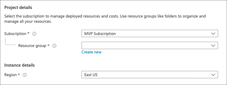
For consistency (and to support some of the core features), the first step should always be called basics. Basics is used to capture the scope for deployment. For a resource group, this step is very simple and will typically look like this:
This uses the Microsoft.Common.ResourceScope control, which looks like this:
The location parameter filters the available locations that are displayed. It limits the list to only the regions available in the selected subscription which support the resource types that are listed. For example, adding microsoft.web/serverFarms would filter the locations to those that support App Services. There are other filters available that are documented in the schema. This includes constraints for the name, validations for the groups, and required permissions within the subscription.
Alternatively, you can read the user-friendly documentation 😄
The basics step should have the scope control at a minimum. It can contain other controls in addition. This is also the tab to use if you are creating a simple, single-tab UI.
Begin with the end in mind
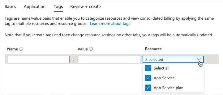
The last definable step is always tags. If this step is present, it allows you to assign tags to your resources based on the type. Azure will always provide the actual final step, Review + create.
The tags step looks like this:
And is implemented with this code:
This step generally only contains the tags control, since it’s an expandable list. It requires you to provide a list of resource types which can be tagged.
The output of the step will be an object that contains an entry for each resource type. Each entry will contain an object made of name-value pairs representing the tags. It’s important to remember that the results will be returned in the same case they are declared. If you have the same resource with multiple cases (Microsoft.Web/sites and microsoft.web/sites), you will see the resource type displayed multiple times and get entries for each!
Microsoft covers this in more detail in these docs and provides an example for ARM templates. For Bicep templates, you need to add an object parameter:
Then, for each taggable resource, a function to extract the tags. For example, for an App Service Plan:
1tags: contains(tagsByResource, 'Microsoft.Web/serverfarms') ? tagsByResource['Microsoft.Web/serverfarms']: {}The hidden features
The form view has a number of UI controls that cover most of your common display needs. The portal provides a list of the most common ones, with the names linked to the documentation and a “copy” button that adds a small JSON implementation to your clipboard. That said, there are additional controls that are available and documented inside of the schema that can also be valuable.
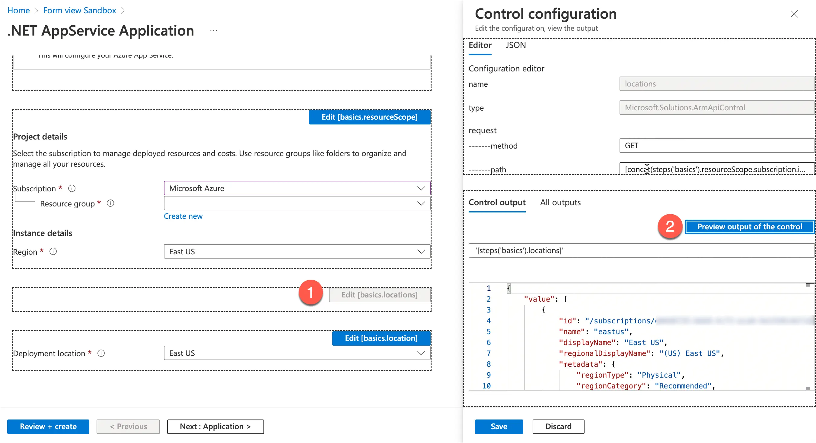
One of my favorite of these controls is Microsoft.Solutions.ArmApiControl. This control is hidden, displaying nothing that would indicate it is present. It exists to make calls to the ARM management endpoint, https://management.azure.com. This control executes a query and returns the results as a JSON object. This object can then be used to populate other controls. Getting the most out of this sometimes means using the debug view (control editing) to see what a given control is generating as an output. That can then be used to customize the endpoint called by the control using some of the built-in functions. Most ARM calls return a value object that contains the results.
For example, let’s say we want to get a list of all available Azure regions in the selected subscription. This needs to be displayed in a dropdown. This information is exposed from the
Subscriptions - List Locations endpoint. The method returns several fields, including .displayName (such as East US), a .regionalDisplayName (for example, (US) East US), and the standardized .name (eastus). That endpoint needs to know the selected subscription ID, which is one of the values exposed by Microsoft.Common.ResourceScope.
The first step is to add the API control. We’ll give this control the name (identifier) locations. The endpoint uses the GET HTTP method. The path should be everything after https://management.azure.com (which makes this agnostic to the particular Azure region). The code will use the concat function to combine the output from the basics step’s resourceScope control to build the URL. The .subscription.id property returns /subscription/{ID}, giving us the key part of the path. The final implementation would be this:
Dynamically binding the drop-down
To build the drop down, we need the list and (optionally) a default value. In a unique approach, the default value must match the displayed label in the list (not the value associated with the label). The steps function can be used to retrieve the displayName for the region from the basics step, allowing the control to default to the same value that is displayed for the Resource Group.
1"defaultValue": "[steps('basics').resourceScope.location.displayName]"The drop-down control requires on an array of JSON objects with a displayed label and a returned value. These are specified in the constraints as allowedValues. To create this set of objects from the API call, we can use the map function. This uses a lambda expression to apply formatting or processing to each member of a collection, returning a new collection. Assuming the API call is implemented on a step called app, we can use logic like the following to implement the list. I’m breaking this out to make the steps easier to see.
The map function gets the results from the locations control. The API returns a collection of results in a property called value. Next, a lambda function is used. For each element of the collection, create a variable called item. Because we can’t directly create a complex object, create a JSON string by using concat. The code configures the .displayName as the label (which matches our earlier defaultValue). The associated value for the field is configured as .name. The parse function is then used to convert this back to an object. A complete implementation could look like this:
 1{
 2    "name": "location",
 3    "type": "Microsoft.Common.DropDown",
 4    "label": "Deployment location",
 5    "defaultValue": "[steps('basics').resourceScope.location.displayName]",
 6    "toolTip": "The location to use for deploying the service",
 7    "filter": true,
 8    "constraints": {
 9        "allowedValues": "[map(steps('app').locations.value, (item) => parse(concat('{\"label\":\"', item.displayName, '\",\"value\":\"', item.name, '\"}')))]",
10        "required": true
11    },
12    "visible": true
13}
Debugging the controls
If you’re not sure which fields are available from a given control, refer to the documentation for that control. Alternatively, select Enable control editing, then Preview. Each control will have an Edit button that you can click. You can then choose Control output and press Preview output of control to see the actual content being generated. When in this mode, you sometimes need to make a selection in the subscription dropdown (even if you’re not changing anything) to re-trigger the bindings and force updates to the other controls.
Deploying to Azure
Here’s the fun part. There are two ways you can make it easy to use this UI automatically when you need to deploy some Azure infrastructure. The first approach is to deploy the form as part of a Template Spec. Microsoft documents the process for using portal forms with Template Specs.
The other approach is to use the Deploy to Azure button. This is simply a graphic you can embed in a markdown file or website that links your publicly-available template to the Azure portal for simple deployment. The default link includes the image graphic and a URL that includes a public endpoint with the template. It’s worth mentioning that “public” can include an Azure Blob Storage URL with a SAS token to minimize the exposure, of course. The interesting thing about this process is how the URL is built.
First, we start with the button:
1Next, we add a link that starts with https://portal.azure.com/#create/Microsoft.Template/uri/, followed by the URI-escaped URL of the template:
1[](https://portal.azure.com/#create/Microsoft.Template/uri/{ARM-TEMPLATE})While not as well documented, the URL can contain additional parameters. Once of those is /uiFormDefinitionUri/, which allows the form template to be included:
1[](https://portal.azure.com/#create/Microsoft.Template/uri/{ARM-TEMPLATE}/uiFormDefinitionUri/{UI-TEMPLATE}A complete example
If you want to see how all of this can come together, I have an example that creates an App Service plan using a custom UI. The associated ARM template is built using Bicep. This sample also contains a GitHub Workflow that can be used to demonstrate an end-to-end process for managing and deploying applications to Azure using infrastructure-as-code principals.
You can find that here: https://github.com/kenmuse/appservice-demo
Happy DevOp’ing!